Skip to contents

Introduction

Session Settings
# Graphs----
face_text='plain'
face_title='plain'
size_title = 14
size_text = 11
legend_size = 11

global_theme <- function() {
  theme_minimal() %+replace%
    theme(
      text = element_text(size = size_text, face = face_text),
      legend.position = "bottom",
      legend.direction = "horizontal", 
      legend.box = "vertical",
      legend.key = element_blank(),
      legend.text = element_text(size = legend_size),
      axis.text = element_text(size = size_text, face = face_text), 
      plot.title = element_text(
        size = size_title, 
        hjust = 0.5
      ),
      plot.subtitle = element_text(hjust = 0.5)
    )
}

# Outputs
options("digits" = 2)

In Brief

This study focuses on the analysis and application of mortality tables within actuarial science, with a particular emphasis on examining French mortality data. Although the Lee-Carter model is widely used for mortality projections, it has significant limitations, particularly in its sensitivity to outliers. Outliers can skew mortality rate estimations, leading to inaccurate forecasts—an issue of critical importance in actuarial work.

To address this challenge, we utilize the rainbow package for detecting outliers in the dataset, followed by the application of the HUrob method. The HUrob method is a robust statistical approach specifically designed to mitigate the influence of outliers, thereby ensuring more accurate and reliable mortality forecasts.

This document provides a comprehensive guide, covering each stage from data importation to advanced modeling and the interpretation of results, equipping readers with the necessary tools to perform robust mortality analysis in actuarial contexts.

Required Packages

Show the code
required_libraries <- c(
  "CASdatasets",
  "tidyverse", 
  "demography",
  "rainbow",
  "forecast",
  "kableExtra",
  "RColorBrewer"
)
invisible(lapply(required_libraries, library, character.only = TRUE))

Data

The data used in this vignette are sourced from the Human Mortality Database (HMD), a collaborative project by the Max Planck Institute for Demographic Research (Germany), University of California, Berkeley (USA), and French Institute for Demographic Studies (France). Available here.

It is a comprehensive repository of detailed mortality and population data. The dataset contains age-specific mortality rates for France, which are critical for analyzing mortality trends and making future projections. Accurate mortality data serves as the foundation for many actuarial tasks, including premium setting, reserve calculation, and the assessment of pension fund solvency.

The dataset is accessed via the hmd.mx function from the demography package, which facilitates the direct download of mortality data from the HMD. The data is structured as a demogdata object, comprising the following components:

  • Years: A vector indicating the range of years for which mortality data is available (e.g., 1900-2022).
  • Ages: A vector representing the specific ages for which mortality rates are recorded, typically ranging from 0 to 110+.
  • Rates: A matrix where each row corresponds to a specific age and each column represents a year. The values are the logarithms of mortality rates, defined as the natural logarithm of the number of deaths per 1,000 individuals at a specific age and year.
  • Population: A matrix analogous to the rates matrix, representing the population exposed to risk at each age and year.
  • Deaths: A matrix that captures the actual number of deaths recorded for each age and year.
  • Type: A character string that specifies whether the data pertains to “male”, “female”, or “total” populations.

Purpose

In the aftermath of a wars or significant public health event, mortality rates can fluctuate unpredictably. For insurance companies, this variability presents a critical challenge: accurately forecasting mortality rates is essential for pricing life insurance policies, determining annuity payments, and calculating the reserves required to cover future claims. If mortality forecasts are inaccurate, it could lead to substantial financial losses, threaten the solvency of an insurer, or impair its ability to meet obligations to policyholders. Therefore, precise and reliable mortality forecasting is not just an academic exercise but a practical necessity for ensuring the financial stability and competitiveness of insurance products.

To address these challenges, this vignette provides a practical and comprehensive guide to analyzing mortality tables, with a specific focus on French mortality data. We will demonstrate the application of advanced actuarial methods to improve mortality forecasting, ensuring that the forecasts remain robust even in the presence of anomalies such as outliers.

To achieve this, we will first utilize the Lee-Carter model, a widely recognized method for mortality projections. This model is effective in capturing long-term mortality trends but is sensitive to outliers—an issue that can lead to distorted mortality rate estimates and inaccurate forecasts.

To mitigate these risks, we will demonstrate the use of the rainbow package for detecting outliers in the dataset. Identifying and managing outliers is crucial for maintaining the accuracy of forecasts. Following this, we will implement the HUrob method, a robust statistical approach specifically designed to reduce the impact of outliers. By employing HUrob, we can ensure that our mortality forecasts are both accurate and reliable, even in the presence of data anomalies.

In summary, this vignette will guide you through a practical approach to improving mortality forecasts, directly addressing the challenges insurers face in an unpredictable world. By following these methods, you will be better equipped to manage the financial risks associated with fluctuating mortality rates, ensuring the solvency and stability of insurance operations.

Importation

To access the Human Mortality Database (HMD) in R, you need to use the demography package. With your HMD login credentials, you can retrieve mortality data for specific countries using the hmd.mx() function. For example, to download data for France, you can use the country code "FRATNP". Simply replace your email and password with your own credentials in the following code, and the data will be ready for analysis:

france <- hmd.mx("FRATNP", "your email", "your password", label = "FRA")

In this vignette, we use a subset of the French HMD database hosted in CASdatasets name freHMD.

Overview of a Mortality Table

To stabilize the variance associated with high age-specific mortality rates, the raw data is automatically transformed by taking the logarithm in the plot function and other related functions within the demography package. This logarithmic transformation is particularly beneficial for actuaries, as it ensures that the model’s outputs are both reliable and interpretable across different age groups. This is crucial when assessing the risk profiles of various insurance products, where accurate and consistent modeling of mortality rates is essential. As a result, the mortality models discussed in this chapter are all presented on a log scale.

france.sm <- smooth.demogdata(france, obs.var = "theoretical")

colors <- colorRampPalette(rainbow(length(france.sm$year)))(length(france.sm$year))

plot(france.sm, series = "male", type = "l",
     col = colors,
     main = "",
     ylab = "Log-Mortality Rate", xlab = "Age")


selected_years <- c(1900, 1916, 1943, 2000, 2020)
legend_colors <- colors[france.sm$year %in% selected_years]

legend("bottomright", legend = as.character(selected_years),
       col = legend_colors,
       lty = 1, 
       title = "Year", cex = 0.8)
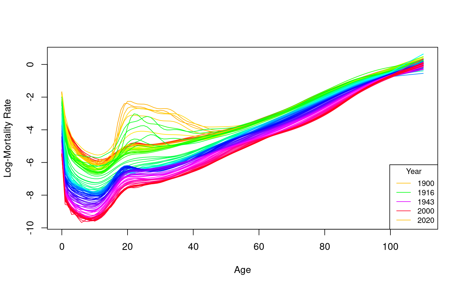
Figure 1: Smoothed Male Log-Mortality Rates from 1900 to 2022 in France

The plot displays smoothed mortality rates over time, revealing a characteristic “U-shape” mortality pattern: high rates during infancy, a decline in early adulthood, and a steady increase with age. The smoothing technique effectively clarifies underlying trends by reducing noise in the data, making significant patterns more discernible. Notably, the plot highlights the impact of historical events, with distinct “humps” corresponding to increased mortality during World War I and World War II. Additionally, a noticeable decrease in mortality rates among younger populations over time is evident, reflecting improvements in public health and living conditions.

This visualization serves as a foundational tool for further analysis, including forecasting, outlier detection, and robust modeling, providing a clear starting point for more advanced actuarial assessments.

Fitting the Lee-Carter Model

Lee-Carter Model Structure

The model structure proposed by Lee and Carter (1992) is represented by the following equation:

log(mx,t)=ax+bxkt+ϵx,t,(1) \log(m_{x,t}) = a_x + b_x k_t + \epsilon_{x,t}, \quad \text{(1)}

Where:

  • axa_x represents the age-specific pattern of the log mortality rates averaged across years.
  • bxb_x is the first principal component, capturing the relative change in the log mortality rate at each age.
  • ktk_t denotes the first set of principal component scores for year tt, measuring the overall level of the log mortality rates.
  • ϵx,t\epsilon_{x,t} is the residual at age xx and year tt, accounting for the model’s error term.

The model assumes homoskedastic errors and is typically estimated using singular value decomposition (SVD), a method that efficiently extracts the principal components.

Over-Parameterization and Identifiability

The Lee-Carter (LC) model in Equation (1) is over-parameterized, meaning that the model’s structure remains invariant under certain transformations:

{ax,bx,kt}{ax,bx/c,ckt}, \{a_x, b_x, k_t\} \rightarrow \{a_x, b_x/c, c k_t\},

{ax,bx,kt}{axcbx,bx,kt+c}. \{a_x, b_x, k_t\} \rightarrow \{a_x - c b_x, b_x, k_t + c\}.

To address this issue and ensure model identifiability, Lee and Carter (1992) imposed the following constraints:

t=1nkt=0, \sum_{t=1}^{n} k_t = 0,

x=x1xpbx=1. \sum_{x=x_1}^{x_p} b_x = 1.

These constraints normalize the model, ensuring that ktk_t is centered and that the age-specific impact bxb_x is appropriately scaled.

Adjusting and Forecasting ktk_t

In addition to the above constraints, the Lee-Carter method adjusts ktk_t by refitting it to the observed total number of deaths. This adjustment process gives more weight to ages with higher mortality rates, effectively counterbalancing the impact of the logarithmic transformation of the mortality rates.

The adjusted ktk_t is then extrapolated using time series models, particularly ARIMA models. Lee and Carter (1992) utilized a random walk with drift (RWD) model for this purpose, which is expressed as:

kt=kt1+d+et, k_t = k_{t-1} + d + e_t,

where:

  • dd represents the drift parameter, measuring the average annual change in the series.
  • ete_t is an uncorrelated error term.

The random walk with drift (RWD) model has proven to provide satisfactory results in various applications, as noted by subsequent studies (Tuljapurkar, Li, and Boe (2000); Lee and Miller (2001); Lazar and Denuit (2005)).

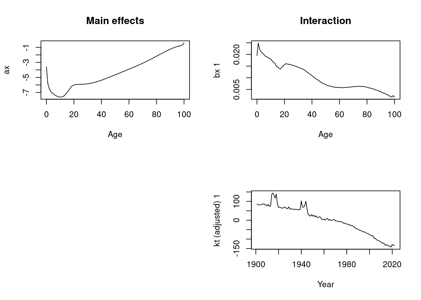
lc.male <- lca(france, series="male")
plot(lc.male)

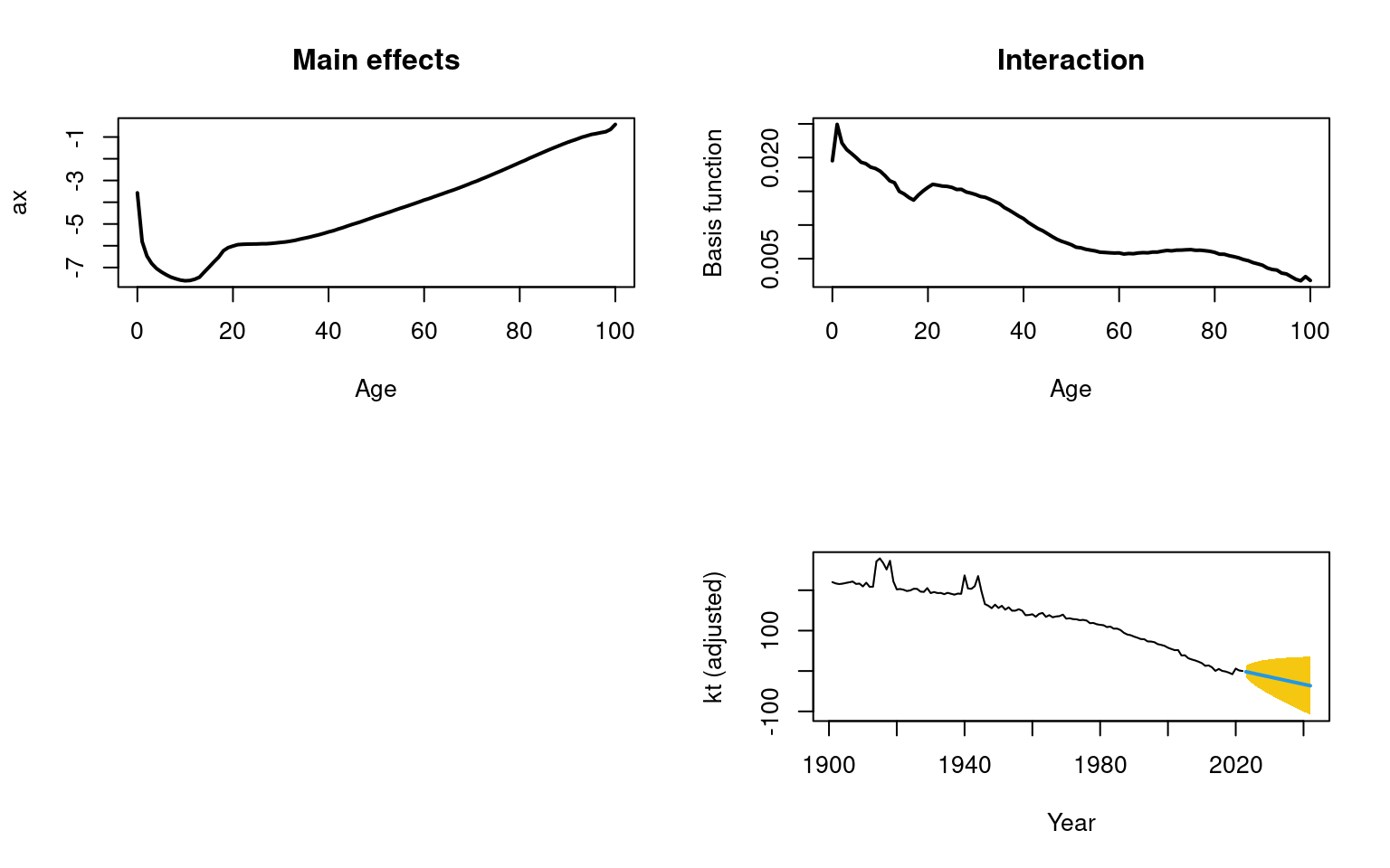
Once the Lee-Carter model is fitted, actuaries can utilize it to forecast future mortality rates, a critical step in pricing life insurance products, setting aside reserves, and estimating liabilities in pension schemes. The three panels in the plot effectively illustrate the main effects and interaction terms that the Lee-Carter model captures:

  1. axa_x - Main Effects (Age-Specific Average Mortality Pattern): This panel displays the general mortality pattern across different ages. The characteristic “U-shape” is evident, with higher mortality rates during infancy, a decline through early adulthood, and a steady increase with advancing age. This pattern aligns with the general mortality trends observed in many populations, providing a foundational understanding of age-specific mortality behavior.

  2. bxb_x - Age-Specific Sensitivity to the Mortality Index: This panel highlights the sensitivity of each age group to changes in the overall mortality index $ k_t $. Younger age groups exhibit higher sensitivity, which gradually decreases with age. This implies that fluctuations in mortality, whether improvements or deteriorations, have a more pronounced impact on younger individuals compared to older ones.

  3. ktk_t - Time Index of Mortality: The bottom panel traces the changes in mortality over time, capturing the influence of historical events and broader trends. The noticeable “humps” in the early 20th century correspond to periods of war and other significant disruptions. The long-term decline in ktk_t reflects overall improvements in mortality rates over the years, indicative of advancements in healthcare, living conditions, and public health interventions.

These components are essential for forecasting future mortality rates, a process facilitated by the forecast() function from the forecast package. The output of the Lee-Carter model, particularly the forecasted ktk_t, enables actuaries to project future mortality rates, which is crucial for financial planning and decision-making in life insurance and pension schemes.

These visualizations are invaluable tools for actuaries, aiding in the communication of mortality trends to stakeholders, regulators, and policymakers. By presenting the projections in a clear and transparent manner, actuaries ensure that their forecasts are based on robust statistical analysis, thereby supporting informed decision-making.

# Perform the forecast
forecast.lc.male <- forecast(lc.male, h = 20)
Code for plotting the Lee-Carter components
# Plot the forecast components
plot(forecast.lc.male, plot.type = "component", lwd = 2)
Figure 2: Forecast Components for Male Mortality
Code for plotting the Lee-Carter forecast
# Plot the historical mortality data with adjusted line width and color
plot(france, series = "male", ylim = c(-13, 2), lty = 2, lwd = 1, col = "#440154FF",
     main = "",
     ylab = "Log-Mortality Rate", xlab = "Age")

# Add the forecast lines with distinct color and line type
lines(forecast.lc.male, col = "#1E88E5", lty = 1, lwd = 2)

# Add a legend to distinguish between observed and forecasted data
legend("bottomright", legend = c("Observed Data", "Forecast"),
       col = c("#440154FF", "#1E88E5"), lty = c(2, 1), lwd = 2, cex = 0.8)
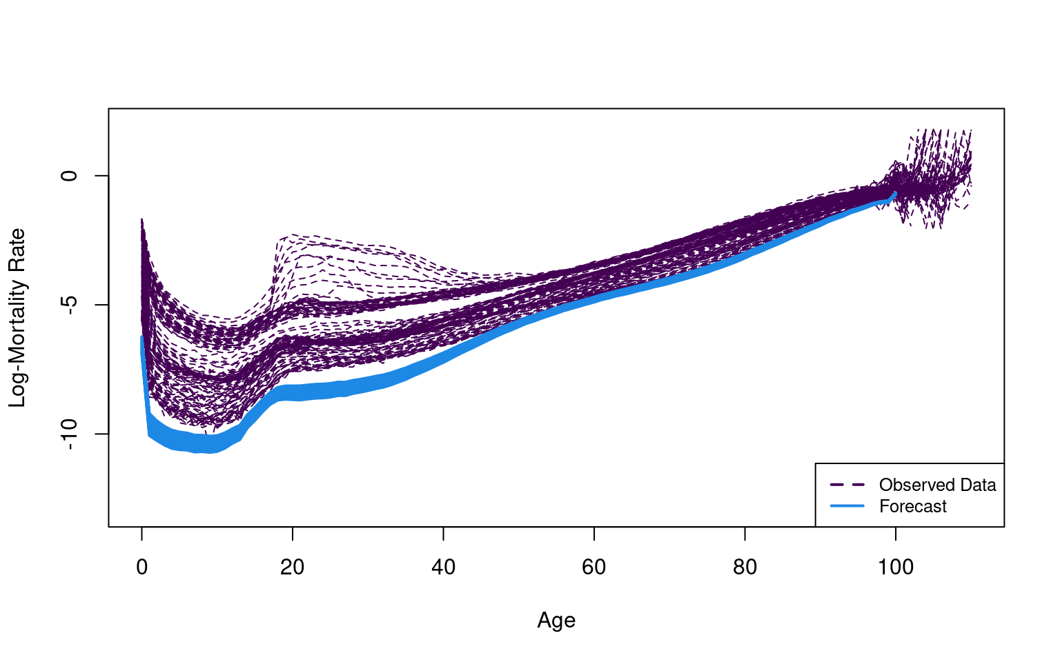
Figure 3: Lee-Carter Method: Observed and Forecasted (next 20 years) Male Log-Mortality Rates in France

Interpretation of the Plot

The plot displays the smoothed historical male death rates for France from 1900 to 2022, along with forecasted mortality rates. While the Lee-Carter model is a widely utilized tool in actuarial science, the results presented here raise concerns about the accuracy of its forecasts:

  • Observed Data (Black Dashed Line): The historical mortality rates exhibit the characteristic “U-shape” pattern, with elevated mortality at infancy, reduced rates during early adulthood, and a steady increase with advancing age. However, the density of the black lines makes it challenging to discern specific trends, particularly among younger age groups, where subtle variations are easily obscured.

  • Forecasted Data (Blue Line): The forecasted mortality rates, depicted by the blue line, generally align with the overall trend of the observed data. However, these forecasts appear overly optimistic, projecting significantly lower future mortality rates than might be realistic. This discrepancy raises concerns about the model’s ability to accurately capture the complexity of future mortality trends, particularly in light of potential unforeseen events or structural changes in population health.

  • Model Effectiveness: Although the Lee-Carter model effectively captures the historical trend of declining mortality rates, the forecasts generated here may be too “optimistic,” predicting unrealistically low mortality rates in the future. Such over-optimism in the forecasts could be misleading, potentially leading to an underestimation of future mortality risks. This poses a significant risk for actuarial practices, where accurate mortality projections are crucial for pricing, reserving, and long-term financial planning.

Given these observations, it is essential to critically evaluate the model’s assumptions and consider the potential limitations of the Lee-Carter model in forecasting long-term mortality trends. Supplementing this analysis with alternative models or incorporating scenario testing could provide a more comprehensive understanding of future mortality risks.

Key Takeaways

  • The Lee-Carter model serves as a foundational framework for mortality forecasting. However, the results presented here suggest that the model may be overly optimistic, potentially underestimating future death rates.

  • To enhance the reliability and practical applicability of these forecasts, it is essential to revisit the model’s assumptions and explore alternative approaches or adjustments, particularly in relation to outliers that might be skewing the results.

  • To address these concerns, we will implement the HUrob method, which is specifically designed to handle outliers that could be influencing the model’s forecasts. These outliers may be contributing to the overly optimistic predictions, and HUrob provides a robust mechanism to adjust for these anomalies, thereby producing more accurate and reliable forecasts.

This interpretation underscores the importance of critically evaluating both the model and its output, ensuring that the forecasts are not only statistically robust but also aligned with realistic expectations for future mortality trends. By incorporating methods like HUrob, we can better manage the influence of outliers and improve the accuracy of our mortality projections, ultimately leading to more reliable actuarial decisions.

Outlier Detection with Rainbow package

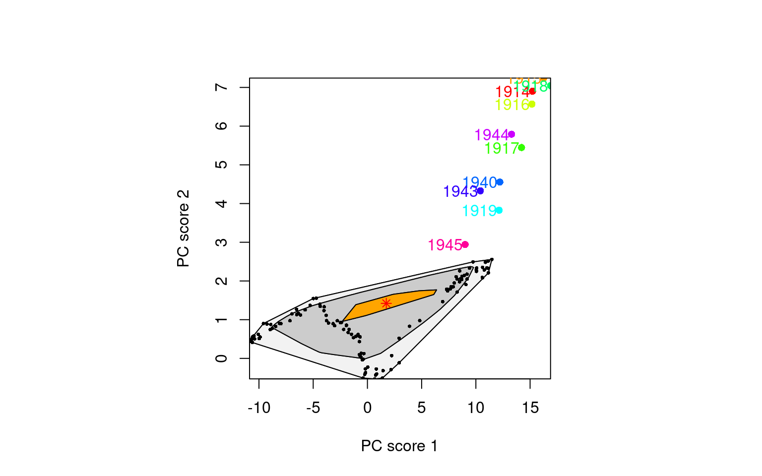
We will proceed as if unaware of the historical impact of wars, preparing the data as functional data to apply the fboxplot method. The fboxplot function generates a functional boxplot, which extends the traditional boxplot concept to functional data. This method provides a comprehensive summary of the distribution of mortality rate curves by:

  • Central Region: Identifying the most typical curve, representing the central tendency of the data.
  • Variability: Highlighting the variability among the mortality curves, which is depicted as shaded regions. These regions indicate the spread of the data and help visualize how mortality rates fluctuate across different years or age groups.
  • Outliers: Detecting potential outliers, represented by curves that fall outside the shaded envelope. These outliers may correspond to unusual years or age groups with mortality rates that significantly deviate from the norm, potentially due to historical events like wars or data anomalies.

By applying the fboxplot method, we can effectively identify and analyze these deviations, enabling a more nuanced understanding of the data. This approach allows for the detection of unusual patterns that may require further investigation or adjustment in the modeling process, particularly in cases where historical events or anomalies have a significant impact on mortality trends.

# filtering age <= 100 and years >= 1880
year_filter <- france$year >= 1880
filtered_years <- france$year[year_filter]
filtered_mortality_rates <- france$rate$male[, year_filter]

age_filter <- france$age <= 100
filtered_ages <- france$age[age_filter]
log_mortality_rates <- log(filtered_mortality_rates[age_filter, ])

# Create a Functional Data Set (fds) object for the fboxplot
log_mortality_fds <- fds(x = filtered_ages, y = log_mortality_rates)
Code for the following functional HDR boxplot
fboxplot(data = log_mortality_fds,
         na.rm = TRUE,
         plot.type = "bivariate",   # For a bivariate boxplot
         type = "bag",               # For an bag boxplot
         alpha = c(0.05, 0.5),       # Coverage level
         projmethod = "PCAproj",     # Use PCA projection method
         factor = 1.96,              # Factor for the outer region
         xlab = "Age",               
         ylab = "Log-Mortality Rate",
         shadecols = gray((9:1)/10), # Colors for shaded regions
         pointcol = 1,               # Color of points (outliers and mode)
         plotlegend = TRUE,         
         legendpos = "bottomright",  
         ncol = 2)                  
Figure 5: Bivariate Boxplot of Log-Mortality Rates in France

Robust Hyndman–Ullah (HUrob) Method

Outliers, or unusual data points, can seriously affect the performance of modeling and forecasting. The HUrob method is designed to eliminate their effect. This method utilizes the reflection-based principal component analysis (RAPCA) algorithm of Hubert, Rousseeuw, and Verboven (2002) to obtain projection-pursuit estimates of principal components and their associated scores. The integrated squared error provides a measure of the accuracy of the principal component approximation for each year (Hyndman and Ullah (2007)). Outlying years result in a larger integrated squared error than the critical value obtained by assuming normality of ϵt(x)\epsilon_t(x) (see Hyndman and Ullah (2007) for details). By assigning zero weight to outliers, the HUrob method can then be used to model and forecast mortality rates without the possible influence of outliers.

How the HUrob Method Works

The HUrob method uses an advanced technique called reflection-based principal component analysis (RAPCA). This technique helps to identify the main patterns in the data while filtering out those outliers that could lead to inaccurate predictions.

Here’s a simplified explanation:

  • Principal Components: Think of these as the main patterns in your data. The method tries to capture these patterns and ignore the noise or outliers.
  • Outliers: These are unusual data points that don’t fit the general pattern. If left unchecked, they can distort the model’s predictions.

By assigning zero weight to outliers, the HUrob method effectively ignores these problematic data points, making the model’s predictions more robust and trustworthy.

Using the functional data analysis paradigm of Ramsay and Silverman (2005), Hyndman and Ullah (2007) proposed a nonparametric method for modeling and forecasting log mortality rates. This approach extends the Lee-Carter (LC) method in four ways:

  • The log mortality rates are smoothed prior to modeling.
  • Functional principal components analysis (FPCA) is used.
  • More than one principal component is used in forecasting.
  • The forecasting models for the principal component scores are typically more complex than the RWD model.

The log mortality rates are smoothed using penalized regression splines. To emphasize that age, xx, is now considered a continuous variable, we write mt(x)m_t(x) to represent mortality rates for age x[x1,xp]x \in [x_1, x_p] in year tt. We then define zt(x)=logmt(x)z_t(x) = \log m_t(x) and write:

zt(xi)=ft(xi)+σt(xi)ϵt,i,i=1,,p,t=1,,n,(2) z_t(x_i) = f_t(x_i) + \sigma_t(x_i) \epsilon_{t,i}, \quad i = 1, \dots, p, \quad t = 1, \dots, n,\ (2)

where ft(xi)f_t(x_i) denotes a smooth function of xx as before; σt(xi)\sigma_t(x_i) allows the amount of noise to vary with xix_i in year tt, thus rectifying the assumption of homoskedastic error in the LC model; and ϵt,i\epsilon_{t,i} is an independent and identically distributed standard normal random variable.

Given continuous age xx, functional principal components analysis (FPCA) is used in the decomposition. The set of age-specific mortality curves is decomposed into orthogonal functional principal components and their uncorrelated principal component scores. That is:

ft(x)=a(x)+j=1Jbj(x)kt,j+et(x), f_t(x) = a(x) + \sum_{j=1}^{J} b_j(x) k_{t,j} + e_t(x),

where a(x)a(x) is the mean function estimated by â(x)=1nt=1nft(x)\hat{a}(x) = \frac{1}{n} \sum_{t=1}^{n} f_t(x); {b1(x),,bJ(x)}\{b_1(x), \dots, b_J(x)\} is a set of the first JJ functional principal components; {kt,1,,kt,J}\{k_{t,1}, \dots, k_{t,J}\} is a set of uncorrelated principal component scores; et(x)e_t(x) is the residual function with mean zero; and J<nJ < n is the number of principal components used. Note that we use a(x)a(x) rather than axa_x to emphasize that xx is treated as a continuous variable.

Multiple principal components are used because the additional components capture non-random patterns that are not explained by the first principal component (Booth, Maindonald, and Smith (2002); Renshaw and Haberman (2003); Koissi, Shapiro, and Högnäs (2006)). Hyndman and Ullah (2007) found J=6J = 6 to be larger than the number of components actually required to produce white noise residuals, and this is the default value. The conditions for the existence and uniqueness of kt,jk_{t,j} are discussed by Cardot, Ferraty & Sarda (2003).

Although Lee and Carter (1992) did not rule out the possibility of a more complex time series model for the ktk_t series, in practice, an RWD model has typically been employed in the LC method. For higher-order principal components, which are orthogonal by definition to the first component, other time series models arise for the principal component scores. For all components, the HUrob method selects the optimal time series model using standard model-selection procedures (e.g., AIC). By conditioning on the observed data I={z1(x),,zn(x)}I = \{z_1(x), \dots, z_n(x)\} and the set of functional principal components B={b1(x),,bJ(x)}B = \{b_1(x), \dots, b_J(x)\}, the hh-step-ahead forecast of zn+h(x)z_{n+h}(x) can be obtained by:

ẑn+h|n(x)=E[zn+h(x)|I,B]=â(x)+j=1Jbj(x)k̂n+h|n,j, \hat{z}_{n+h|n}(x) = E[z_{n+h}(x) | I, B] = \hat{a}(x) + \sum_{j=1}^{J} b_j(x) \hat{k}_{n+h|n,j},

where k̂n+h|n,j\hat{k}_{n+h|n,j} denotes the hh-step-ahead forecast of kn+h,jk_{n+h,j} using a univariate time series model, such as the optimal ARIMA model selected by the automatic algorithm of Hyndman et al. (2008), or an exponential smoothing state space model (Hyndman et al. (2008)).

Because of the orthogonality of all components, it is easy to derive the forecast variance as:

v̂n+h|n(x)=var[zn+h(x)|I,B]=σa2(x)+j=1Jbj2(x)un+h|n,j+v(x)+σt2(x), \hat{v}_{n+h|n}(x) = \text{var}[z_{n+h}(x) | I, B] = \sigma^2_a(x) + \sum_{j=1}^{J} b_j^2(x) u_{n+h|n,j} + v(x) + \sigma^2_t(x),

where σa2(x)\sigma^2_a(x) is the variance of â(x)\hat{a}(x); un+h|n,ju_{n+h|n,j} is the variance of kn+h,j|k1,j,,kn,jk_{n+h,j} | k_{1,j}, \dots, k_{n,j} (obtained from the time series model); v(x)v(x) is the variance of et(x)e_t(x); and σt(x)\sigma_t(x) is defined in Equation (2). This expression is used to construct prediction intervals for future mortality rates in R.

Key Enhancements Over Traditional Methods

The HUrob method improves upon traditional methods like the Lee-Carter (LC) model in several ways:

  • Smoothing: Log mortality rates are smoothed using techniques that stabilize the data, reducing the impact of random fluctuations.
  • Principal Components Analysis (PCA): Instead of relying on just one principal component, this method uses multiple components to capture more of the complexity in the data.
  • Advanced Time Series Models: For predicting future trends, the HUrob method uses sophisticated models like ARIMA, which are more flexible and accurate than simpler models.

Putting It All Together

In simple terms, the HUrob method is a powerful tool for making more accurate predictions about future mortality rates. By carefully managing outliers and using advanced statistical techniques, this method helps actuaries and analysts make better-informed decisions, whether they are pricing life insurance products, setting aside reserves, or planning for the future.
Conclusion

The HUrob method enhances mortality rate modeling by addressing the impact of outliers using reflection-based principal component analysis (RAPCA). By eliminating the influence of outliers, the method ensures more robust forecasts. The approach builds on the Lee-Carter model by smoothing log mortality rates, applying functional principal components analysis (FPCA), and using multiple principal components for forecasting. These components are modeled with more complex time series models, like ARIMA, instead of the simpler Random Walk with Drift (RWD). The method effectively captures mortality trends while accounting for varying noise across ages and years, leading to more accurate predictions with well-defined prediction intervals.

models(france.fcast)

-- Coefficient 1 --
Series: xx[, i]
ARIMA(0,1,1) with drift

Coefficients:
         ma1   drift
      -0.177  -0.172
s.e.   0.098   0.094

sigma^2 = 1.61:  log likelihood = -199
AIC=405   AICc=405   BIC=413

-- Coefficient 2 --
Series: xx[, i]
ARIMA(1,1,1) with drift

Coefficients:
       ar1    ma1  drift
      0.35  -0.91  0.030
s.e.  0.11   0.06  0.013

sigma^2 = 0.806:  log likelihood = -158
AIC=323   AICc=324   BIC=335

-- Coefficient 3 --
Series: xx[, i]
ARIMA(2,1,2)

Coefficients:
       ar1    ar2    ma1   ma2
      0.39  -0.46  -1.04  0.64
s.e.  0.17   0.12   0.15  0.13

sigma^2 = 0.823:  log likelihood = -158
AIC=327   AICc=327   BIC=341

-- Coefficient 4 --
Series: xx[, i]
ARIMA(1,1,1)

Coefficients:
       ar1     ma1
      0.54  -0.946
s.e.  0.14   0.093

sigma^2 = 0.533:  log likelihood = -133
AIC=272   AICc=273   BIC=281

-- Coefficient 5 --
Series: xx[, i]
ARIMA(2,0,0) with zero mean

Coefficients:
        ar1    ar2
      0.547  0.192
s.e.  0.088  0.088

sigma^2 = 0.611:  log likelihood = -142
AIC=291   AICc=291   BIC=299

-- Coefficient 6 --
Series: xx[, i]
ARIMA(0,0,2) with zero mean

Coefficients:
       ma1    ma2
      0.28  0.257
s.e.  0.09  0.076

sigma^2 = 0.297:  log likelihood = -98
AIC=202   AICc=203   BIC=211

The output summarizes various ARIMA models fitted to different components of the HUrob method.

  • Coefficient 1: ARIMA(0,1,1) with drift. This model reflects a weak negative moving average (ma1 = -0.177) and a negative drift (-0.172), suggesting a slight downward trend over time. The fit is moderate, with AIC = 405 and BIC = 413.

  • Coefficient 2: ARIMA(1,1,1) with drift. This model captures stronger autocorrelation with ar1 = 0.35 and ma1 = -0.90. The drift term is positive (0.030), suggesting a slight upward trend. The fit improves with AIC = 323 and BIC = 335.

  • Coefficient 3: ARIMA(2,1,2). A more complex model with two autoregressive and two moving average components. The mixed signs in the coefficients indicate intricate temporal dynamics. The model fits similarly to Coefficient 2, with AIC = 327 and BIC = 341.

  • Coefficient 4: ARIMA(1,1,1). A simpler model with no drift, featuring moderate autocorrelation (ar1 = 0.54) and strong negative moving average (ma1 = -0.946). This model has a lower sigma^2 and improves in fit with AIC = 272 and BIC = 281.

  • Coefficient 5: ARIMA(2,0,0). This model features autoregressive terms (ar1 = 0.547, ar2 = 0.192) and does not include a constant or drift, implying the process has no inherent trend. The residual variance is moderate (sigma^2 = 0.611), and the fit is reasonable with AIC = 291 and BIC = 299.

  • Coefficient 6: ARIMA(0,0,2). This model includes two moving average terms (ma1 = 0.28, ma2 = 0.257) and also does not have a constant, suggesting no trend. It achieves the lowest residual variance (sigma^2 = 0.297) and provides a solid fit with AIC = 202 and BIC = 211.

Forecasting and Reconstruction

The coefficients from these ARIMA models are used to forecast the principal component scores derived from the functional principal component analysis (FPCA). These scores represent the key patterns in the mortality data over time.

  • Forecasting: The ARIMA models, using the estimated coefficients (e.g., ar1, ma1, drift), predict future values of these scores.

  • Reconstruction: The forecasted scores are then combined with the functional principal components to reconstruct future mortality rates using the formula:

ẑn+h|n(x)=â(x)+j=1Jbj(x)k̂n+h|n,j \hat{z}_{n+h|n}(x) = \hat{a}(x) + \sum_{j=1}^{J} b_j(x) \hat{k}_{n+h|n,j}

  • Final Output: This process yields the forecasted mortality rates, along with their associated variance and prediction intervals.

Practical Implications

These forecasts are essential for predicting future mortality trends across different age groups, providing a robust basis for actuarial analysis and decision-making.

References

The date came from HMD. Human Mortality Database. Max Planck Institute for Demographic Research (Germany), University of California, Berkeley (USA), and French Institute for Demographic Studies (France). Available HMD.

Booth, Heather, John Maindonald, and Len Smith. 2002. “Applying Lee-Carter Under Conditions of Variable Mortality Decline.” Population Studies 56 (3): 325–36.
Hubert, Mia, Peter J Rousseeuw, and Sabine Verboven. 2002. “A Fast Method for Robust Principal Components with Applications to Chemometrics.” Chemometrics and Intelligent Laboratory Systems 60 (1-2): 101–11.
Hyndman, Rob J, Anne B Koehler, Ralph D Snyder, and Simone Grose. 2008. “Forecasting with Exponential Smoothing: The State Space Approach.” Springer Series in Statistics.
Hyndman, Rob J, and Md Shahid Ullah. 2007. “Robust Forecasting of Mortality and Fertility Rates: A Functional Data Approach.” Computational Statistics & Data Analysis 51 (10): 4942–56.
Koissi, Marie-Claire, Arnold F Shapiro, and George Högnäs. 2006. “The State of the Art in the Lee–Carter Model.” Insurance: Mathematics and Economics 38 (1): 2–23.
Lazar, Avner, and Michel Denuit. 2005. “Robust Methods for Actuarial Applications.” Insurance: Mathematics and Economics 36 (1): 1–21.
Lee, Ronald D, and Lawrence R Carter. 1992. “Modeling and Forecasting US Mortality.” Journal of the American Statistical Association 87 (419): 659–71.
Lee, Ronald D, and Timothy Miller. 2001. “Evaluating the Performance of the Lee-Carter Method for Forecasting Mortality.” Demography 38 (4): 537–49.
Ramsay, James O, and Bernard W Silverman. 2005. Functional Data Analysis. Springer.
Renshaw, Arthur E, and Steven Haberman. 2003. “Lee–Carter Mortality Forecasting with Age-Specific Enhancement.” Insurance: Mathematics and Economics 33 (2): 255–72.
Tuljapurkar, Shripad, Nan Li, and Carl Boe. 2000. “A Universal Pattern of Mortality Decline in the G7 Countries.” Nature 405 (6788): 789–92.

See also

For more similar mortality datasets, see freMortTables : French mortality datasets or visit the HMD website.